This time Feedback loop was dedicated to the Map!
Let’s look into players feedback and suggestions regarding this interesting topic.
➡️ – Players’ feedback
⬅️ – Game Centre Answer
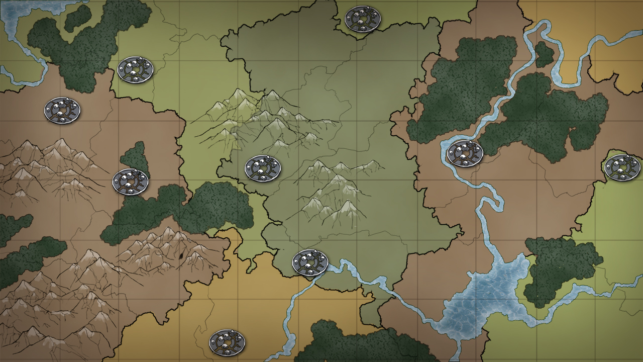
General feedback and requests for improvements
Zoom
➡️ Players would like to have more zoom options.
We have tested something like this before. We are open to the suggestion via the usual process, including community votes.
Map size
➡️ Players would like to have 801×801 maps back.
⬅️ Before we consider to reintroduce these maps, we would need to know the reasons behind the request: are they related to longer travel times, to less competition…? Thank you to get back to us with more details so we can evaluate the possibilities.
Croppers
➡️ Replace 15c to 18c in gray area.
⬅️We advise you to submit the idea via the suggestion process.
➡️ Add 12c fields
⬅️ Please here also explain the reasons behind this – is it intended to allow for more worthy settle spots or other reason?
➡️ Make cropper finder work without gold club, at least the players without gold will not ask the ones who take it anymore.
⬅️ We have sent this idea to the product management team. They would be the ones in charge of agreeing to this. We will get back to you.
➡️ Equal distribution of croppers in each quadrant.
⬅️ Yes we believe this could help with fairness. However keep in mind that there are limits to this: we cannot force-distribute equally the registration of players.
➡️ Better distribution of 15c/9c croppers and more 15c/9c 100%+ croppers in general. Current state forces more players to settle far away from the center. Plus it almost eliminates any possibility for someone that starts a server not the first hours to get a decent cropper. Therefore nobody joins after the first day… settling fast and getting a good cropper needs skill and will still need it to get the best croppers, but there is no reason to eliminate from a server people that couldn’t start immediately when it opened. Give people plenty of decent croppers and let them fight. Especially now that artifacts spawn closer to the center, we need more fights closer to it therefore more croppers.
⬅️We do believe that increasing the supply will proportionally decrease the need to fight in earlier stages of the game. And it isn’t necessarily the direction we’d like the game to take.
➡️ Instead of giving the same number of croppers to each quadramnt, we could imagine a system where the more players there are in a quadrant, the more 15c with oasis are generated. Like in the beginning, the map is visible until a radius of 80. The rest is invisible and after 3 days (on x1), the rest of the map is generated considering the total population of the quadrant. The more villages there are and the higher their pop, the more 15c are generated and vice/versa.
⬅️ Unfortunately this change would rely on too many unpredictable factors and potentially generate countless technical problems. But in the event that we would find a suitable solution for it, it would really be a massive time investment to achieve it. It is nothing we are planning for the time being.
Flags / Marks on the map
➡️ Flags and marking on the map system brought a lot of suggestions from the players:
- Add more options for us to mark the map tiles, such as adding new symbols or colors.It’s almost impossible for noobs to find where they can remove flags from the map as it is so well hidden.
- Mark allied and enemy oases with the appropriate outlines, as if it were a village.
- Marking areas. So that alliance leadership can mark a zone where to settle second villagesfor example
- Add more flags, remove color (they are not visible enough) and put numbers instead of colors.
- Have a flag overview tab.
- Be able to remove all flags in one click.
- Be able to add flags without going through the map.
- Be able to identify who put a flag in the alliance.
- Be able to manage who’s allowed to view these flags in the confederacies.
- More Alliance/Player color choices with distinct colors.
➡️ It would be nice to have a tool to assign colors on the map based on a player’s role. Mapping players would be much more intuitive with colored cells based on attackers/defenders/spy accounts.
Filters and Visibility
- ➡️ Add a filter so that we can filter types of oases, tribes, or alliances.
- Add the possibility to search oases for animals number and how much resources for killing them and this should be a free feature, so that raiding becomes fair.
- Add the possibility to search for all types of villages not only 15 & 9 croppers.
- Make the outlines (alliance/confederation) more marked. Especially when zoomed out, we can barely see the colors.
- Could even do a “tactical” map mode, where all useless details (village size dependent pictures, wilderness/oases pictures etc) are removed, purely to get a better overview of the map.
- Change the graphics of the natar or more or less large villages based on the population.
- Create icons or some identifier for the type of field shown in the map. Don’t make us hover over each field to find out what type it is.
- Players would like to see 7×7 mark on the map e.g. for capturing oases. A lot of players do not know what it looks like or how to count it.
- Spartan and Natar villages are too similar. It caused spartan villages to be added in farmlist by natar village raider.
⬅️ This was changed previously but we will have a further look at it, to see if it was enough.
Add more tooltip information
➡️ It would be nice if the small crosses/shields were visible on the map of the villages, when you move the pointer over them, a small tooltip appears with:
- the type of arrival (spy/raid/attack/assist)
- the number of units
- the arrival time
- X the number of waves arriving.
- Currently, we only have the arrival time of the first wave.
➡️ When you click on a village from the map, you can see if it is in any farm lists but not in which lists exactly.
This interface should be revised so that it is clearer which lists it is in and with which units. At the moment, it’s not clear when you want to edit from the map.
➡️ Show distance from the village to our active village when the mouse is over the square.
⬅️ All these suggestions have received a very warm welcome from our game designer. We will for sure set them aside and dive into them again when we can rework the feature. Thank you very much for the long list of great ideas.
Mobile Improvements

➡️ Players playing on mobile say the map is really hard to use. It either lags or shows one field next (especially when moving 50 fields away) – so they would like mobile improvements.
There have been complaints of qol issues, players complained its unwieldy during increasing/decreasing focus, visually difficult to read certain parts and visuals not parsed correctly/the image loading incomplete (they dont believe its connection issues).
⬅️ We have shared the feedback with the development and mobile teams.
Spawning

⬅️ In general we want to avoid randomness to allow strategies to unfold as planned. However, for WWs this might be still possible as they spawn on game world start.
➡️ Dividing each quadrant to like 20 equal areas and delaying the spawn in the far ones until the near areas are full, or x hours after the previous area opening. So players who registered faster would still have a chance to settle in a slot that is 50 fields away faster than the majority of players who spawned in that area.
➡️ Remove static spawn points for building plans.
➡️ Make artifact spawn locations vary a lot more. Now old and experienced players have way too big of an edge over new players. Or more like there are no new players in travian. Give them a chance to hold artifacts for a day or two.
⬅️ Here introducing randomness is something we want to avoid as players build their strategies around those artefacts.
Other ideas
➡️ Less natar on the map, now there are too many and the conquests are too easy (if not eliminated or reduced, you have to give malus to whoever conquers them)
➡️ Smaller grey areas around the map with for example natar fortresses guarding them
➡️ Make map non-interactable for first hour after server start (can’t see oasis, neighbors).
- Hinders spawn abusers who make dozens of accounts to get better spawn
- Allows everyone to register and get ready for when map opens to contest oasis on equal grounds
- Less lag during server start
⬅️ We consider that for the most part these ideas – which are really fun and interesting, would definitely alter the game way too much. Making changes, bringing improvements of any kind is a satisfactory approach. But our mission is to maintain the game that you know, while aiming at improving it – rather than changing it into a game you wouldn’t recognize 😉
